Please use this identifier to cite or link to this item:
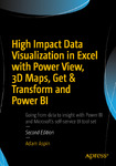
http://lib.hpu.edu.vn/handle/123456789/26180| Title: | Data Visualization in Excel 2016 |
| Authors: | Aspin, Adam |
| Keywords: | Data Visualization Excel 2016 Excel |
| Issue Date: | 2016 |
| Abstract: | Take business intelligence delivery to a new level that is interactive, engaging, even fun, all while driving commercial success through sound decision making. Do this through the power of visualization using this updated edition covering new features and added support for visualization in Excel 2016, and describing the latest developments in Get & Transform and DAX. The example data set has also been updated to demonstrate all that Microsofts self-service business intelligence suite is now capable of. Data Visualization in Excel 2016: Power View, 3D Maps, Get & Transform, and Power BI, 2nd Edition helps in harnessing the power of Microsoft’s flagship, self-service business intelligence suite to deliver compelling and interactive insight with remarkable ease. Learn the essential techniques needed to enhance the look and feel of reports and dashboards so that you can seize your audience’s attention and provide them with clear and accurate information. Also learn to integrate data from a variety of sources and create coherent data models displaying clear metrics and attributes. Power View is Microsofts ground-breaking tool for ad-hoc data visualization and analysis. Its designed to produce elegant and visually arresting output. Its also built to enhance user experience through polished interactivity. Power Map is a similarly powerful mechanism for analyzing data across geographic and political units. Get & Transform lets you load, shape and streamline data from multiple sources. Power Pivot can extend and develop data into a dynamic model. Power BI allows you to share your findings with colleagues, and present your insights to clients. Data Visualization in Excel 2016: Power View, 3D Maps, Get & Transform, and Power BI helps you master this suite of powerful tools from Microsoft. Youll learn to identify data sources, and to save time by preparing your underlying data correctly. Youll also learn to deliver your powerful visualizations and analyses through the cloud to PCs, tablets and smartphones. Simple techniques take raw data and convert it into information. Slicing and dicing metrics delivers interactive insight. Visually arresting output grabs and focuses attention on key indicators. |
| URI: | https://lib.hpu.edu.vn/handle/123456789/26180 |
| Appears in Collections: | Technology |
Files in This Item:
| File | Description | Size | Format | |
|---|---|---|---|---|
| 1012_Data_Visualization_in_Excel_2016.pdf Restricted Access | 30.13 MB | Adobe PDF |  View/Open Request a copy |
Items in DSpace are protected by copyright, with all rights reserved, unless otherwise indicated.
